Hi!
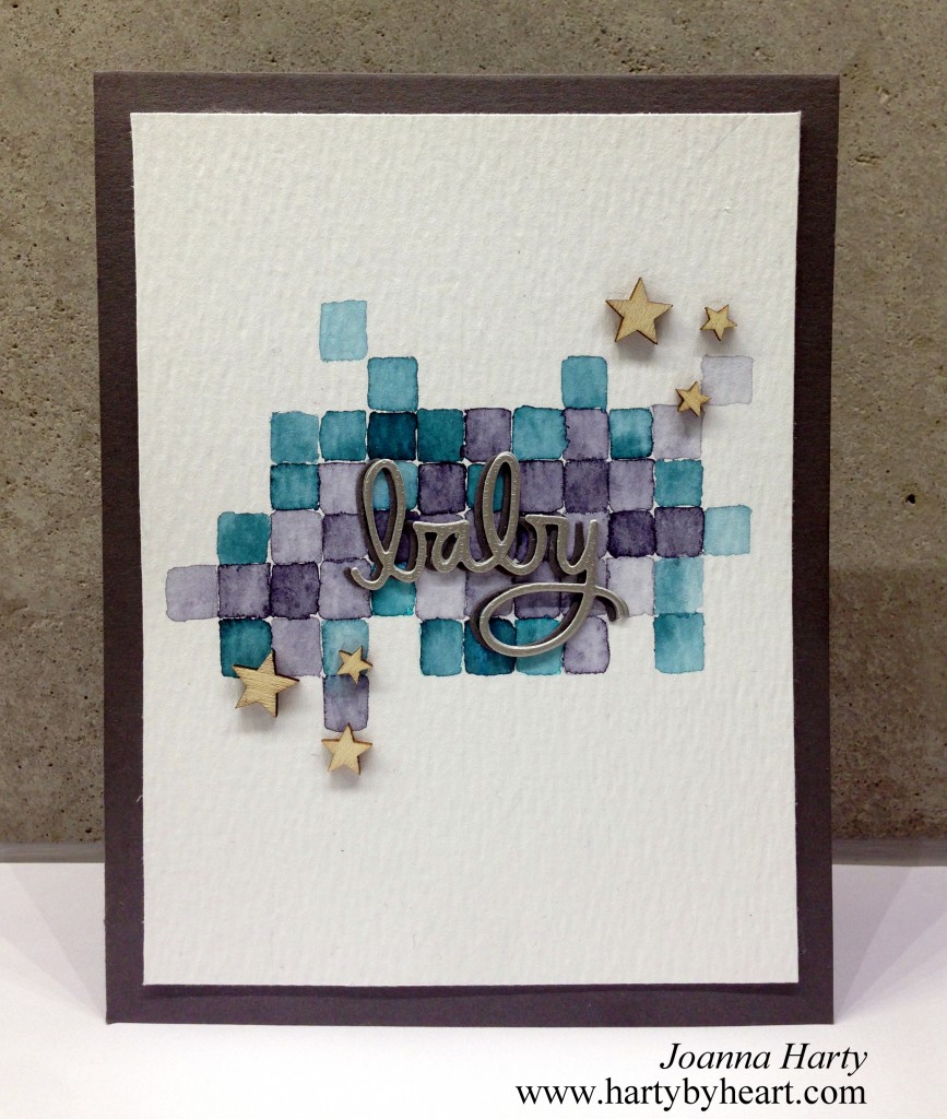
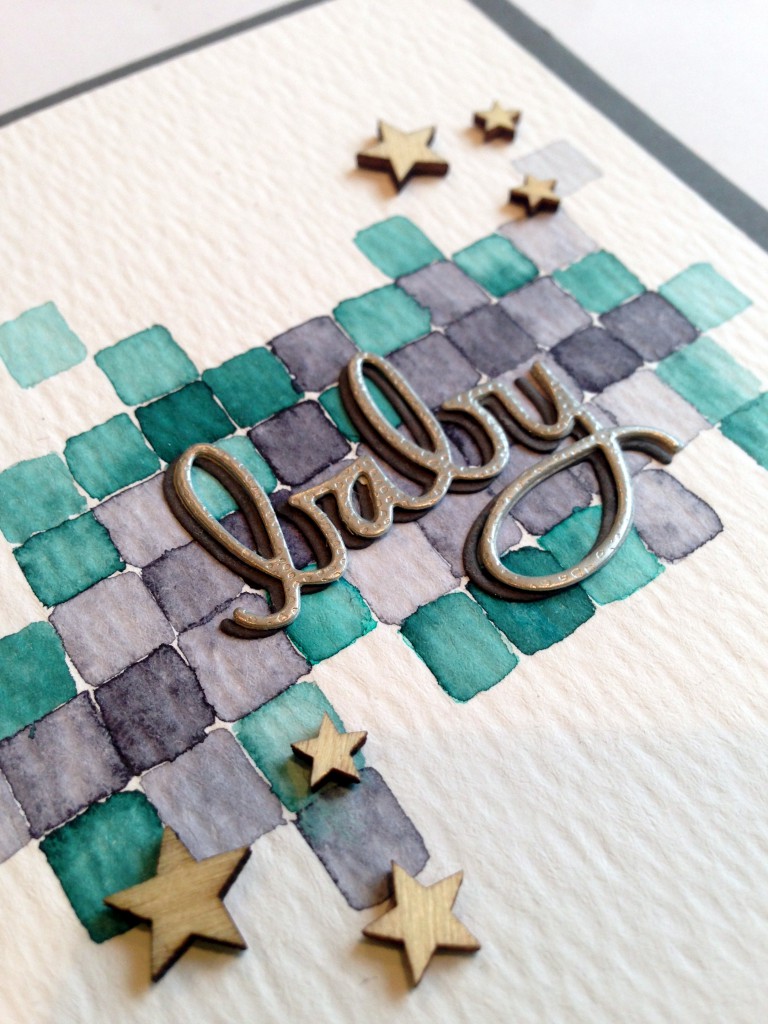
I just bought some Peerless watercolors and I LOVE them! You can get really vibrant colors but today a went for a muted palette, and I only used two colors. My inspiration was pixel art, so that was what I wanted to replicate for my background. I cut the word die two times and adhered them slightly offset, and then adhered the wood stars.
I asked my husband if he liked this card, he is a honest critic and said he didn’t like it at all. He thought that the card would look better if the squares was exactly the same size, I tried to explain how watercolor works and that I wanted a loose effect but he still didn’t like it. I kind of like it so I thought I should share it with you anyway. What do you guys think? Would this card look better if the squares where exactly the same size?
As always, thanks for stopping by, see you soon and take care!

 Challenges: CAS-ual Fridays, Avenue 613, Addicted to Stamps
Supplies:
- Peerless watercolor
- Tim Holtz watercolor paper
- Die – Simon Says Satmp, Baby
- Wood stars – Studio Calico
- Cardstock Simon Says Stamp and Panduro Hobby
