Hi!
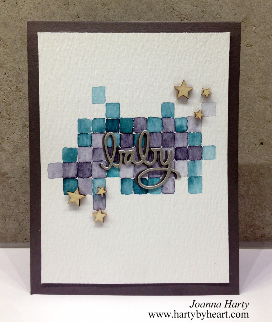
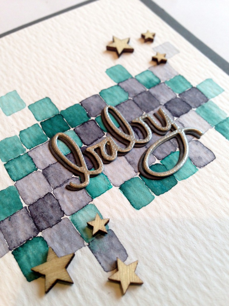
I just bought some Peerless watercolors and I LOVE them! You can get really vibrant colors but today a went for a muted palette, and I only used two colors. My inspiration was pixel art, so that was what I wanted to replicate for my background. I cut the word die two times and adhered them slightly offset, and then adhered the wood stars.
I asked my husband if he liked this card, he is a honest critic and said he didn’t like it at all. He thought that the card would look better if the squares was exactly the same size, I tried to explain how watercolor works and that I wanted a loose effect but he still didn’t like it. I kind of like it so I thought I should share it with you anyway. What do you guys think? Would this card look better if the squares where exactly the same size?
As always, thanks for stopping by, see you soon and take care!

 Challenges: CAS-ual Fridays, Avenue 613, Addicted to Stamps
Supplies:
- Peerless watercolor
- Tim Holtz watercolor paper
- Die – Simon Says Satmp, Baby
- Wood stars – Studio Calico
- Cardstock Simon Says Stamp and Panduro Hobby

I LOVE your card – my husband doesn’t always love the cards I make either – tastes differ. But ths card is so neat! I also love your little wooden stars – fabulous all in all! Thanks for linking up with us at ATSM!
I LOVE your card – my husband doesn’t always love the cards I make either – tastes differ. But this card is so neat! I also love your little wooden stars – fabulous all in all! Thanks for linking up with us at ATSM!
Thanks Cornelia!
I think the card looks great just the way it is. I am going to make a background just like it in the future. Thanks for sharing!
Thanks you so much Tracy! I’m happy that I could inspire!
I love your card just like it is. Husbands often don’t appreciate that hand made “art” is better if it’s not exactly symmetrical as it shows it’s actually been created by hand.
Kathyk
Thanks Kathy! If you ask me there is a lot of things husbands don’t understand….LOL! I’m really happy that you like my card! 🙂
Beautiful water colored background and I love how you created the shadow for your sentiment! Stunning card, Joanna!
Thanks for your sweet comment Barb!
Beautiful CAS and totally gorgeous Joanne
so much inspiration here.
Thanks for playing along at ATSM
Sarah x
I love the softness of your watercolor background. Thanks for joining us at 613 Avenue Create this week and I hope you’ll join us again soon.
Hugs,
Em AKA Creative Em
613 Avenue Create DT
Now I know who the brainy one is, I’ll keep looking for your posts.
Jag tycker kortet är jättefint och tänkte inte ens på att fyrkanterna var olika stora. Det är ju helheten som gör det! Så fint med vattenfärger! Ser det lite överallt nu så det verkar vara “inne” 🙂
Tack så mycket Kia!
Wow I LOVE this card! I pinned it immediately- I hope you don’t mind?- I love the look of the uneven squares! You did an awesome job watercoloring them:)
Thanks Jamie! I’m happy to hear that you like it! Ofcourse I don’t mind if you pinned it, I use pintrest a lot my self, love all the inspiration!
Jag tycker att det var jättefint!!
Tack Decdia!
I think it’s gorgeous! And I DO know how hard that must have been since I’ve been sitting here looking and trying to wrap my head around it! That must have taken some time and patience! And my husband doesn’t like everything I do either. Usually it’s something I really like or think is particularly “artsy” that he doesn’t care for. A simple man with simple tastes. And I often like that Clean & Simple look too, but there is all kinds of room for other stuff that I love. Really nice work!
I REALLY love this card, such a non-conventional style for a baby card! Thanks for playing along with us at CAS-ual Fridays, Rebecca x
Thanks Rebecca!!
Underbart kort, Joanna! Det fina med kortet är ju precis det att rutorna är olika! Gjorde just själv ett baby kort… du är välkommen att besöka min blog om du känner för det 🙂
Tack Laura! Glad att du gillade det!
Hej igen! GRATTIS!!! Om du inte vet vad jag talar om, kolla genast CAS-ual Fridays blog! Nu kan du säga till din man: Där fick du dej! Hahahaha! Kram
Oh, Tack Laura! 🙂 Jag ska genast säga till honom! Hahahaha!
I would say your husband probably doesn’t have an eye for art. This is a fabulous card – very clever.
Thanks Jenny! I’m happy you like it!
I respectfully disagree with your hubby – I love it! Thanks so much for joining us at CASual Fridays 🙂
I completely disagree your husband. I totally loved those watercoloured squares. Beautiful card.Thanks for joining us at CAS-ual Friday´s challenge.
Hugs
Archana
What do husbands know anyway right? 😉 I LOVE this! I love the watercolor , the imperfect lines and especially the color combo. In the future please remember to link back to our challenge at 613 Avenue Create. Please check our winners this week…hint hint 🙂
Hugs,
Kathi
613 Avenue Create, Owner
Gorgeous card! 😀 Love it! 😀 Beautiful colors, squares are such a nice idea, like your shaded word sentiment and wooden stars. 😀
Thanks Milka!
I totally disagree with hubby – this card is gorgeous! The loose watercolor effect and soft edges make it perfect for a baby card. Big congrats on your well deserved win at CAS-ual Fridays!
Thanks for your sweet words Jen!
Congrats on your win, this card is fabulous Joanna!
Thanks Therese!
A really worthy winner!
Congratulations!
So sweet of you Hannelie!
Gratulerar till vinsten! Det blir något att berätta för maken det 😉
Haha! Ja, det kommer det bli! 🙂 Tack Kia!
Fantastic card! I just love it! Congrats on your CAS-ual Fridays win. 🙂
Thanks so much Marcie!
I love this card! I wouldn’t change anything about it. It works!
Thanks Mary! 🙂
There’s nothing like the relief of finding what you’re looking for.
So glad you won!! Well done.
Thank you Jenny, So sweet of you! 🙂